[05. Transparent
It is the packaging that builds an immediate relationship with the recipient. Packaging is transparent when it is sincere, that is, when it tells the truth in full compliance with the rules, and it does so frankly. Through the quality of transparency, it manages to develop a relationship of trust with the recipient.
OL-Lab: when minimalism is synonymous with honesty and frankness

Heaz is a packaging design and branding agency based in South Korea. Among their most interesting works, the packaging for the OL-Lab hair loss shampoo is an example of essentiality and formal cleanliness that with a minimalist approach brings to the center of the attention and enhances the information conveyed by the package.
“Less is more” (from English “less is more”) is an expression that is probably familiar to most. This is a quote attributed to the German designer Mies Van der Rohe (1886-1969), originally referring to architecture, but often also used in the world of arts and design and, more generally, associated with a specific lifestyle. essentiality and inspired by Japanese Zen philosophy. It is, in fact, one of the mottos of the style or artistic movement known as minimalism and one of the principles of the so-called “downshifting” (from the English “climbing gear”) within the world of work and the broader concept of “simple living” (“To live in simplicity”). These tendencies refer to the choice to get rid of the superfluous, to have more physical and mental space to dedicate oneself to loved ones and to take care of oneself.
The goal is, therefore, to pursue a better quality of life, favoring what is essential, what really matters, openly placing itself in contrast with the dynamics of consumerism, which are still widely spread.
But what does it mean to adopt the concept of “less is more” in the design field and, in particular, in the area of packaging design? Often, mistakenly, minimalism is reduced to the sole elimination of all types of decoration, of what is superfluous, of unnecessary elements. Although this is in part certainly true, in reality, this operation of “subtraction” (less) is accompanied by an action of “strengthening” (more) and enhancement of what is considered essential and fundamental.


In the packaging of the OL-Lab shampoo, the transparency and honesty of the packaging in communicating its content and the information conveyed by the label are enhanced and enhanced, through a design intervention that reorganizes and visually balances the label to communicate clearly what is important and useful to know.
The name OL-Lab is made up of “OL”, a unit of measurement used to count hair strands in Korean, and “Lab”, as a laboratory abbreviation: the combination of the two concepts aims to underline the brand’s high specialization in field of hair care products. The expression “perfect green”, used to indicate the type of shampoo, refers to the natural origin of the product’s ingredients. The design of the package, inspired by the graphic language of medical prescriptions and the visual rhetoric of professional “laboratory” products, puts structural and informative transparency at the center of the design intervention, with the aim of generating greater trust in the people who buy and use the product. The front label clearly explains how the product is called (Solution) and what it is for (Effect), its formulation (Formula), the absence of pollutants or harmful to health (All Green Criteria) and the quantity in milliliters and in US fluid ounce (Volume).
Minimalism and transparency – not only formal, but also and above all informative – are considered one of the great trends of 2021 for packaging, which in addition to being more sustainable from an environmental point of view, is thus also more sustainable from the point of view. communicative, eliminating any unnecessary elements and any distraction from what is considered truly important to people. The cosmetic sector, due to the impact it generates on people’s health and on the planet, is certainly one of those that are most worrying about reviewing product packaging so that they are more sustainable and honest in their communication, informing consumers with a language simple and accessible, so that they can make more informed purchasing and consumption decisions.

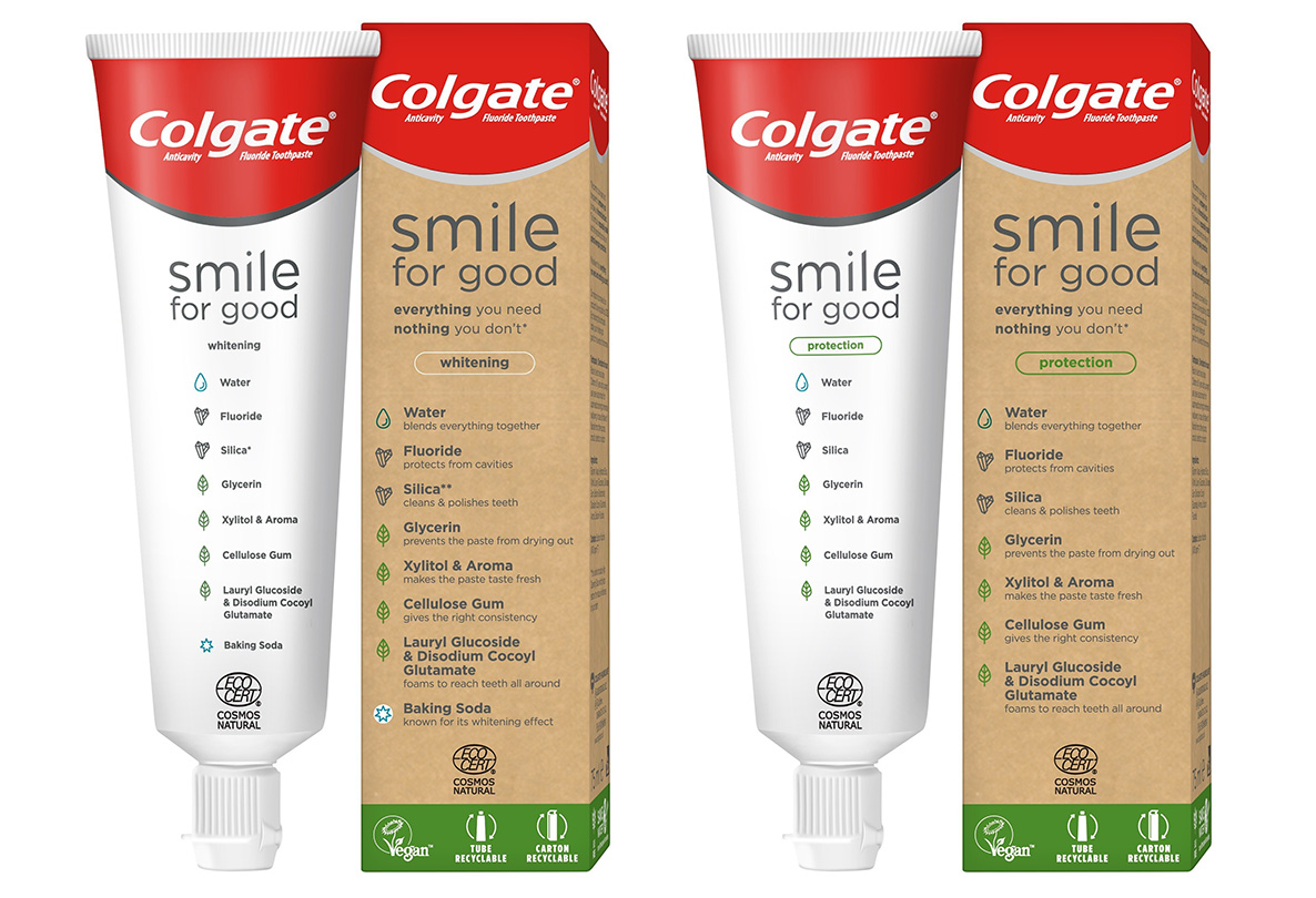
In this line, with the same emphasis on information transparency, the packaging of Colgate‘s Smile for Good toothpaste also clearly communicates its ingredients – reduced to a minimum and, in their almost totality, of natural origin – on the front of the primary packaging. (recyclable plastic tube) as well as the secondary (cardboard box).
Transparent packaging, in addition to being more effective in understanding the product, is also recognized and identified without ambiguity within the contexts of purchase as well as consumption. This entails not only a value for the people who buy and use it,
but also for the reference brand, which can thus strengthen its credibility and win the trust of consumers who with greater awareness, in such an uncertain context and a market so saturated, they demand that companies act with ethical responsibility and concern for the quality of life of people and the environment.